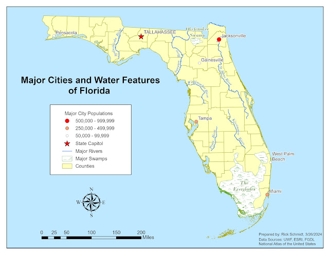
This week's lab module for Computer Cartography 5007L focused on labeling a map by following established typographic principles. We learned where and how to place our labels for different feature types such as major cities, rivers, and swamps. These types of features represent the feature types you find on a map which are points, lines, and areas. We learned the details of how to properly label these features by creating annotation feature classes. this allows you to edit each annotation feature so that you have full control over the position, size, and style of your labels which leads to the optimization of the presentation of your map. Our lab assignment involved creating a map of the state of Florida using ArcGIS Pro that displays the major cities, rivers, and natural features. Below is my finalized map.
Friday, March 29, 2024
Computer Cartography - Module 2 - Typography
Tuesday, March 19, 2024
Computer Cartography - Module 1 - Map Critique
In this week's module, the topic was the principles of map design. We learned about the history of map-making and how designs have evolved over time. Next, we were introduced to cartographer Edward Tufte who outlined 20 design principles that have been reduced to 6 commandments that we used as a guide to reinforce our understanding of what makes a map good or bad. In this lab, we were tasked with choosing an example of a well designed map and an example of a poorly designed map. Using our new knowledge of map design principles from our class lecture we then critiqued our two maps.
This well-designed map displays the state of South Carolina's wildlife area game zones. Although it may not convey complex information, it is a good example of how to balance and organize various map elements. This map is easy to read, aesthetically pleasing, and leaves no mystery to the reader of what the map maker is trying to convey. The first component that appeals to my aesthetic is that the map maker did a great job with the layout balancing the map elements within the white/negative space around the state polygon. The second component that appeals to me is the creator’s use of the increased weight of the boundary lines that help bring attention to the boundaries for each game zone. Personally, I think they might be a little too heavy but I like the idea. The third component that appeals to my aesthetic is that it is void of unnecessary “map junk” and as mentioned in our lecture, it is simple but effectively communicates its objective. The only negative I see about this map is that some of the county labels run into the boundary lines making the last letter in a few cases illegible. The other potential negative is that Zone 1 occupies the northern portions of Oconee, Pickens, and Greenville counties while the southern portions belong to Zone 2. The map reader could be confused because the southern portions of these counties appear as though they could be additional counties that are unlabeled. Overall, this map displays sound design principles as described in Edward Tufte’s 6 Commandments.
Sunday, March 10, 2024
About Me - Orientation Story Map
Hello everyone!
My name is Rick Schmidt and I was born and raised in northwestern
Pennsylvania in a small town called Franklin. In 2011, my wife and I relocated to Port Orange, Florida. We have a 6-year-old son that keeps us busy.
He is currently interested in learning the principles of engineering and
anything outdoors also recently taking an interest in fishing. I joined the UWF
graduate certificate program after comparing a handful of programs concluding
that UWF was the most robust, offering more than others that I looked into. Upon
completion of the program, I hope to gain employment in the GIS field. Ideally,
I would love to obtain a position in the field of archaeology or historic
preservation however, I am open to any role because all experience is valuable. This is my second semester in my journey to
obtain my GIS graduate certificate here at UWF. So far, I have thoroughly
enjoyed the courses I have taken at UWF (Intro to GIS and Photo Interpretation
& Remote Sensing). I have learned a ton and cannot wait to build upon the
foundation that I have established. I earned a bachelor’s degree in
anthropology in 2006 from Clarion University of Pennsylvania where I was introduced to GIS through taking an intro class. I was able to apply the skills I learned in that class using ArcMap while employed with the US Forest Service in the
Allegheny National Forest where I worked as an archaeologist for three years.
Outside of working and school, I enjoy playing basketball
(played in high school and college) and coaching my son’s sports teams. I enjoy
photography as a hobby and volunteer at a local archaeological site. I also
serve on the Volusia County Historic Preservation Board.
I look forward to working with everyone this semester!
Here is a link to my Story Map: Rick's Story Map
Blog Post #4 - GIS Day
For my GIS Day event, I had the opportunity to discuss GIS in two different settings: first with friends while on a weekend trip, and then w...
-
In Module 6, we learned about Suitability and Least Cost Path Analysis. We were introduced to performing suitability analysis using both vec...
-
This week's lab module for GIS 5027L Remote Sensing and Photo Interpretation focused on supervised vs unsupervised classification of ima...
-
Our final project involved analyzing a proposed transmission line corridor by Florida Power and Light (FPL) in Manatee and Sarasota Counties...


