Wednesday, August 7, 2024

Applications in GIS - Module 6 - Suitability & Least Cost Analysis

In Module 6, we learned about Suitability and Least Cost Path Analysis. We were introduced to performing suitability analysis using both vector and raster analysis tools. We prepared our data for suitability analysis using different approaches, such as Boolean and scoring, and adjusted specific parameters using scoring and weighting. Additionally, we performed least-cost path and corridor analysis using cost surfaces as well.

In Scenario 2, our task was to perform a suitability analysis for a land developer. We analyzed several variables including proximity to roads, elevation slope, proximity to rivers, and land cover type. These variables were reclassified and ranked based on the value of each cell in the raster. The raster layers were then combined using the overlay tool. Finally, we were required to create a map layout comparing the results from the two alternatives. Below is my final product.


Saturday, August 3, 2024

Applications in GIS - Module 5 - Damage Assessment

In this module, we delved deeper into the impact of Hurricane Sandy, focusing on damage assessment. To complete this task we learned how to create raster mosaics for pre and post hurricane, created attribute domains to categorize damage, and utilized our skills to decide how to summarize the data from the damage assessment.

To begin we used meteorological data to create a storm track map showing Sandy's progression from below the Caribbean islands on October 22nd, 2012 until it made landfall on the northeast coast of the United States as a Category 1 hurricane on October 29th, 2012. 


To complete our damage assessment we used our pre and post imagery to assess the damage to structures in our study area. Each property in our study area had to be identified and categorized according to the domains that we created. Each domain provided a choice for what level of damage each property appeared to have based on our remote imagery. After assessing the damage and symbolizing the data we were tasked with creating a polyline feature class representing the pre-storm coastline. I then created a multi-ring buffer establishing a 100m, 200m, and 300m buffer. This was used to summarize the data and help discern and identify patterns. Below are my results:


Sunday, July 28, 2024

Applications in GIS - Module 4 - Coastal Flooding

This week's module for Applications in GIS we were tasked with conducting three different coastal flood analyses. With the use of digital elevation models we delineated coastal flood zones. These analyses utilized both raster and vector data to ultimately achieve our desired result. This lab proved to very challenging for me as I had some issues early on that prohibited me from completing all the steps.

The initial analysis consisted of creating a raster of coastal New Jersey post hurricane Sandy showing erosion and buildup. Below is my map for this analysis where the darkest red shading represents the greatest erosion and the darkest blue represents the areas of the most buildup.


For the final portion of the lab we were tasked with analyzing storm surge in Collier County, Florida. Two DEMs were initially used one by the USGS and another LiDAR derived used to create 1 meter storm surge models. These were to be used to analyze and determine the number of buildings that would be affected by a 1 meter storm surge. Unfortunately, I was unable to complete this objective in its entirety. I was unable to understand the Region Group tool so I skipped it so my data isn't as accurate as it should be. Below is a map showing my two storm surge models.


Overall, this was a challenging model for me because I had some issues understanding some instruction starting in analysis 2. After getting behind I struggled to regroup after becoming frustrated. That said, I was able to get back on track and make some progress with analysis 3 even though I was unable to complete it in its entirety.

Thursday, July 18, 2024

Applications in GIS - Module 3 - Visibility Analysis

In this week's module for Applications in GIS, we were introduced to numerous 3D visualization techniques using ArcGIS Pro. Using ArcGIS Pro you can visualize your data in 3D by using a 3D scene. Using 3D scenes can be a powerful tool to enhance the visualization of your data by adding realistic environmental effects making it more attractive to your audience. 

Our assignment for this week was to complete a series of ESRI training courses that introduced us to numerous 3D data visualization techniques. The courses we were assigned included the following courses:


1. Introduction to 3D Visualization

2. Performing Line of Site Analysis

3. Performing Viewshed Analysis in ArcGIS Pro

4. Sharing 3D Content Using Scene Layer Packages 


In the first course, Introduction to 3D Visualization we completed 4 different exercises that taught us about visualizing 3D data in three different views: a map view, a local scene view, or a global scene view. We learned why and when the different views should be utilized, to most effectively display data. We also learned how to determine elevation types, cartographic offset, vertical exaggeration, and extrusion types and methods. The results of a couple of the exercises can be viewed below:


In the above image, we applied realistic enhancements to a downtown San Diego, California local and global scene such as illumination effects, enhanced tree symbology, and detailed buildings.


In the above image, we extruded 2D features by attributes creating a 3D scene. The building parcels shown are not depicted by actual height but rather by property value with yellow representing residential properties, pink commercial properties, and the two gray parcels public housing.


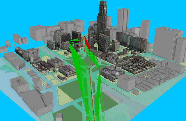
In the second course, Performing Line of Sight Analysis we performed a line of site analysis using a DEM of Philadelphia, Pennsylvania, a parade line, and locations for observers to determine which locations along the route could be observed by security personnel from two observation points. By using ArcGIS 3D analyst tools we were able to determine the optimal line of sight comparing lines greater than 1,100ft and 600ft. Below is a screenshot taken during the process of the analysis.


In the third course, Performing Viewshed Analysis in ArcGIS Pro we created a local scene depicting the hypothetical placement of a new lighting system for a campground in Eastern New York. Using the Viewshed tool, we modeled the range visibility at 3 meters and 10 meters above the surface. Below are the results of the analysis.

The above image shows the results of the 3 meter analysis.

The above image shows the results of the 10 meter analysis.


In the final course, Sharing 3D Content Using Scene Layer Packages we learned how to author a 3D scene using a set of data from the city of Portland, Oregon. Using methods similar to previous courses we converted 2D buildings and trees to 3D features. Our extruded building polygons were converted to multipatch features and the trees were converted to 3D symbology. Finally, we created a scene layer package from our multipatch feature data (the buildings) and published it as a hosted scene layer using ArcGIS Online. Below are two screenshots from the exercises.

The image above depicts the city of Portland global scene with multipatch building features and symbolized trees.

The image above depicts a scene from the published hosted scene layer from ArcGIS Online.


Overall, I really enjoyed these courses and learned a lot of new tools and methods that have provided me with a base knowledge of the 3D visualization capabilities of ArcGIS Pro. 


Thursday, July 11, 2024

Applications in GIS - Module 2 - Forestry and Lidar

In the second module for Applications in GIS we were introduced to a more in depth look into LiDAR. LiDAR stands for "Light Detection and Ranging", and while it has been a remote sensing method traditionally used in forestry science, I was first introduced to it while working the field of archaeology. This week's module focused on how LiDAR is applied in forest management and earth science in general.

In this week's lab we worked with LiDAR data from the Shenandoah National Park, Virginia, to examine tree height and tree canopy density.  The LiDAR data we used was obtained from the USGS in the form of an .las file, and then converted to a digital elevation model (DEM). To do this, we used the LAS Dataset to Raster tool in ArcGIS Pro. Next we created a forest height from the DEM and created a map with an accompanying chart showing the tree height. To finish we created a canopy density layer using the LAS to MultiPoint tool, Point to Raster tool, IS NULL tool, Con tool, Plus tool, and finally the Divide tool. 

Below are the maps I created as a result of the data that was generated throughout the process of the lab.


Monday, July 8, 2024

Applications in GIS - Module 1 - Crime Analysis

In the first module for Applications in GIS we were introduced to some mapping techniques employed in crime analysis. These techniques are used to determine hotspots in criminal activity that can be utilized to determine crime rates, identify crime patterns, and compare the reliability of hotspot mapping to predict future crime.

For this module, we were required to create maps using crime data, specifically focusing on homicides in Chicago in 2017 and 2018. Below are three distinct maps illustrating the distribution of homicides in 2017. These maps included: a grid overlay thematic map highlighting areas with the highest 20% of homicides in Chicago, a kernel density map showcasing areas with homicides occurring at three times the mean average, and a local Moran's I map delineating areas aggregated by meaningful boundaries.


Part of the assignment included providing a hypothetical policy recommendation to a police chief on which hotspot map would be the best for predicting future homicides. I would suggest using the Kernel Density map because it would allow for a concentration of resources in areas with the highest density of homicides and has an almost optimal prediction rate. With Kernel Density, one could pinpoint areas with triple the mean homicide rate, whereas with the grid overlay, one could only identify areas in the top 20%. Although Local Moran I's clusters high values within aggregated boundaries, the area might appear broad on the map and could limit police time and resource availability.

Overall, this was a great learning experience that exemplified how GIS principles and technology can be applied to help solve real-world problems. I'm looking forward to learning more GIS applications in the coming modules.


Monday, July 1, 2024

Applications in GIS - About Me Story Map

Hello everyone!

My name is Rick Schmidt and I was born and raised in northwestern Pennsylvania in a small town called Franklin. In 2011, my wife and I relocated to Port Orange, Florida. We have a 6-year-old son (soon to be 7!) that keeps us busy. He is currently interested in learning the principles of engineering and anything outdoors also recently taking an interest in fishing. I joined the UWF graduate certificate program after comparing a handful of programs concluding that UWF was the most robust, offering more than others that I looked into. I earned a bachelor’s degree in anthropology in 2006 from Clarion University of Pennsylvania where I was introduced to GIS through taking an intro class. I was able to apply the skills I learned in that class using ArcMap while employed with the US Forest Service in the Allegheny National Forest where I worked as an archaeologist for three years. 

This is my 5th course in my journey to obtain my GIS graduate certificate here at UWF having just finished the GIS Programming course. Much has changed in the last few months as I ended up accepting a position as an Environmental Scientist at a small environmental firm. I have learned so much through this program and look forward to finishing strong and applying my GIS knowledge in my new position. 

Outside of working and school, I spend time studying the bible, playing basketball and occasionally coaching my son’s sports teams with my wife. In my free time I also enjoy photography as a hobby and volunteer at a local archaeological site in Ormond Beach, Fl. I also serve on the Volusia County Historic Preservation Board.

I look forward to working with everyone this semester!

Here is a link to my StoryMap

Tuesday, June 25, 2024

GIS Programming - Module 6 - Working with Geometries

Module 6 for GIS Programming tasked us with writing a script that gathered geographic data from a river shapefile and writing the data to a TXT file. This required us to build upon what we have learned utilizing a search cursor to iterate over the river shapefile geometries, using nested loops, with the end goal being a populated TXT file containing the name, x,y, coordinates, OID, and the number of vertices for each row of the features in the rivers shapefile.

The increased complexity of this assignment was a little intimidating and I found that sticking to the template and flowchart was crucial for success. I got off track a few times and ended up making some mistakes that required me to back track. I thought that I was finished on a few occasions but found I had overlooked some crucial details. One of these was that my nested for loops were incorrect and another was that my TXT file was not being saved in my results folder. 

Overall, this was a challenging module and a great finish to the course. I have certainly learned a lot in a short time period and look forward to continuing to build upon what I have learned. Below is my flowchart and a snippet from the resulting TXT file.


Tuesday, June 18, 2024

GIS Programming - Module 5 - Exploring & Manipulating Data

 The topic for Module 5 for GIS Programming was exploring and manipulating data. In this module we covered a lot of ground. Some of the major outcomes were learning how to work with different types of cursors to manipulate data, working with list and describe functions, as well as creating and population dictionaries. Another useful topic we covered was how to use search cursors with SQL expressions.

Our task for our lab assignment was to create a script that created and populated a new file geodatabase followed by creating and populating a dictionary containing the names and population of the cities in new Mexico that are county seats.

The initial steps of the task went pretty smooth but I did get hung up when I forgot to update my environment after creating the new file geodatabase. Another thing that gave me some temporary issues was creating my SQL expression in the search cursor. I was able to get through with some help from the exercise document and ESRI documentation and much trial and error. I also I had some issues placing the \n character to create proper space between messages but after more trial and error I was able to things where I wanted them. I finished adding my print statements and GetMessages which gave me a few minor issues but again with trial and error and some tips from the discussion board I was able to get them where I wanted for the most part.

Below are the screenshots of my script output and a flowchart I created to guide myself through the creation of my script.


Overall, this was a really challenging task and I spent a ton of time trying to complete it. There was a lot of trial and error but through the process I can say that I am starting see Python on a more holistic level.


Monday, June 10, 2024

GIS Programming - Module 4 - Geoprocessing

In module 4 we were challenged with two different tasks that utilized skills we have gained over the past few weeks using ModelBuilder and Python to perform geoprocessing tasks. In the initial task we were asked to create a model and script tool using ModelBuilder. This model needed to accomplish three geoprocessing tasks. Using provided data this model needed to clip a provided soil shapefile to the parameters of a basin shapefile. Next it needed to select all soils that were classified as "Not prime farmland" using an SQL expression. Finally, it needed to erase the "Not prime farmland" soil selection from the basin polygon. The output of this model seen below shows soils suitable for farming.


Our second task was completed in Notebook within ArcGIS Pro. This consisted of writing a Python geoprocessing script that accomplished three tasks on a hospitals shapefile. The first task was to add XY coordinates to the shapefile which I accomplished using the arcpy.management.AddXY() tool. Second, a 1,000 meter buffer needed to be created around each hospital. I accomplished this by using the arcpy.analysis.Buffer() tool. The third and final task was to dissolve the individual buffers into a single feature. I used the arcpy.management.Dissolve() tool to accomplish this. Using the GetMessages() function our script needed to print messages from the tool after each of the three tasks. Below is a screenshot of my script output messages and my map showing the dissolved buffers.


Overall, I went into this lab feeling a little intimidated but it went much smoother than anticipated aside from a few minor hang ups. It is very interesting to learn how to utilize ModelBuilder and Python to accomplish tasks. I really liked the visual component of using ModelBuilder. It makes me think of how I could have utilized these skills while working on past assignments in the program. 

Wednesday, June 5, 2024

GIS Programming - Module 3 - Debugging and Error Handling

Module 3 for GIS Programming focused on the debugging and error handling of Python scripts. We were introduced to common error messages and how to implement debugging procedures. The lecture and exercise materials built upon this foundation providing us some instruction and practice on how to interpret script error messages while recognizing and correcting syntax errors and exceptions so that scripts run successfully.

The first script we were tasked with contained two syntax errors. Syntax errors are similar to making typographical errors or saying you are grammatically incorrect. Some common issues related to syntax errors are misspellings, lack of punctuation, wrong use of upper/lowercase letters, and indentation issues. This first script when successfully run prints out the names of all fields in the attribute table of the ArcGIS Pro Project we were working with.  Below is a screenshot of my script output after correcting the two syntax issues.


The second script contained several errors/exceptions. These included issues with the undefined filepaths, forward and back slash issues, misspelled variables, and other issues mostly related to misspellings. These types of named exceptions present with messages including names such as NameError, AttributeError, and TypeError. Ultimately I was able to get the script to run, however I was receiving an OSError. After doing a quick Google search for OSError in ArcGIS Pro I found an ESRI discussion post saying that this could likely be due to having the project open and running. I then closed the project and ran the script.  the script ran successfully without any error messages. When successfully run the script prints out the names of all the layers in the ArcGIS Pro Project. Below is a screenshot of the output after all the errors/exceptions are corrected.


The third script involved running a script even though it contained errors. This is done by modifying the script by adding a try-except statement. The challenge here was deciding where the try-except statements need to be placed in order to make the script run successfully despite containing errors. When used, a try-except statement can catch and handle exceptions, thus avoiding a runtime error and sudden termination of a script. The script contained two different parts where Part A returns an error message but continues to run Part B printing out the name, data source, and spatial reference of each layer. Below is a screenshot of the script output after successfully placing the try-except statements as well as a flowchart depicting the steps I took in the process.


After feeling overwhelmed and defeated by last week's module I was very concerned coming into this week. However, after spending some extra time trying to get a grasp on things this module went much better than I anticipated. Hopefully, I can continue to move forward and build upon what I have learned.


Wednesday, May 29, 2024

GIS Programming - Module 2 - Python Fundamentals

Module 2 for GIS Programming introduced us to the fundamentals of Python programming. This included but was not limited to using data types such as strings and lists, utilizing various methods and functions, and using for and loop structures.  

In the lab, we were assigned 4 tasks that built upon each other ultimately running a script for a dice game. Step 1 involved creating a variable for your full name using a string. This was followed by splitting the string into a list and then using indexing to print your last name.

Step 2 involved correcting two errors in a pre-written script for a dice game followed by Step 3 which required creating a loop that added 20 random numbers between 0 and 10 to a list. I began to struggle at this point but after several attempts, I successfully ran a script. After this, I was completely overwhelmed and burnt out. Unfortunately, I was unable to complete Step 4. Below is a screenshot depicting my outputs as well as a flowchart showing the basic steps and what I completed.


Wednesday, May 22, 2024

GIS Programming - Module 1 - Python Environments and Flowcharts

Module 1 for GIS Programming built upon the principles of Python we were introduced to in our reading and lecture content. This consisted of learning the basics of the Python programming language, learning to write pseudocode, create flowcharts, and learning the basics of how Python editors work. This was all very intimidating considering I have no experience in computer programming languages however after completing this lab the intimidation factor has decreased.

We began the module by running a python the Python script file CreateModFolders.py using the IDLE. Running this script resulted in the creation of the folder directory needed that will be used throughout this course. This saved a great amount of time compared to having to create this directory of folders manually.

The second portion of this module consisted of answering our process summary questions which included creating a flowchart that illustrates converting 3 radians to degrees followed by printing the result. The formula provided for this task was as follows:

          degrees = radians*180/pi 

I referred to Chapter 3 in Agarwal et al. to complete this task. Following the examples in the text I first created the pseudocode and then created the flowchart using draw.io since we used it in the examples we completed in our lecture. My results can be seen below.


We concluded the module by reading "The Zen of Python" by Tim Peters and writing a paragraph on what we thought it meant.  My personal thoughts after reading it were that it was apparent that aside from being functional Python code should be written in a manner that is easily interpreted, straight forward as possible, and should be consistent and implicit. I was hearing that the harmony of the language is important otherwise the value and reliability would be greatly diminished becoming difficult for others to utilize. I can appreciate this framework since I have worked in many different occupational fields, with each having their own "language". 

Overall, this was a great introduction and I'm looking forward to building upon the foundation of what I have now learned.


Friday, May 3, 2024

Computer Cartography - Module 7 - Google Earth

This week's lab module for Computer Cartography 5007L involved converting ArcGIS Pro feature classes to KML files, creating Google Earth maps, and recording Google Earth tours. 

To complete the tasks we utilized ArcGIS Pro and Google Earth Pro. We first converted some ArcGIS feature classes using the Layer to KML geoprocessing tool in ArcGIS Pro. This results in a KMZ file we could open in Google Earth Pro. For our map of South Florida, we now had data for population density and surface water features. Next, we added a legend image overlay. The following is my finished product.

In the second portion of the lab, we recorded a Google Earth Tour of South Florida. This involved creating some placemarks for the Miami metropolitan area and the major cities of South Florida. These placemarks served as the stops on the recorded fly-through video tour. One of the more interesting aspects of the tour is that the downtowns, especially of Miami and Tampa feature 3D renderings of many of the buildings which is really neat. I could definitely use some fine-tuning of my video recording controls, but with practice, I'm sure I can improve significantly. 

Thursday, April 25, 2024

Computer Cartography - Module 6 - Isarithmic Mapping

This week's lab module for Computer Cartography 5007L introduced Isarithmic mapping. Isarithmic maps are another type of thematic map that is used to depict continuous and smooth geographic phenomena. There are two types of Israthmic maps, isometric and isopleth. Isometric maps are constructed with true point data in which data values are measured at a point location. Isopleth maps on the other hand are produced using conceptual point data which is collected over an area and presumed to be at point locations. Since Isarithmic maps depict continuous and smooth geographic phenomena throughout a region based on data collected at control points these maps use interpolation which is the process of determining data values for points or areas between those with a known data value.

For our lab, we utilized precipitation data for the State of Washington that was obtained and calculated using the PRISM (Parameter-elevation Relationships on Independent Slopes Model). This interpolation model leverages point data and an underlying grid, such as a Digital Elevation Model (DEM), to generate gridded estimates of monthly or annual precipitation. Our precipitation dataset was generated by applying this method to point data collected from weather monitoring stations and the calculated climate elevation regression for each grid cell within the DEM. The dataset takes into account physiographic factors that may influence climate patterns.

For our first map, we created an average precipitation map for the state of Washington using continuous tones. Our continuous tone map shows a smooth transition for all values and each point is shaded with a hue proportional to the data value at that point. In our second map, we used hypsometric tint by using the Int Spatial Analyst tool and contour lines using the Contour List Spatial Analyst tool. The Hypsometric Tint creates color-scaled areas between the contour lines that enhance the map viewer's ability to visualize a 3D surface. The lighter colors are associated with lower values and the darker colors with higher values. The raster data is separated into bands using a range of values that have upper and lower limits which produces a visual that clearly depicts the changes in data.

Below is my final map utilizing hypsometric tint and contoured overlay.


Friday, April 19, 2024

Computer Cartography - Module 5 - Choropleth Mapping

This week's lab module for Computer Cartography 5007L focused on enhancing our understanding of the use of choropleth maps as well as proportional and graduated symbology. 

A choropleth map is a type of thematic map that is used to present data in relative values such as percentages or rates per capita. Choropleth maps are not to be used when mapping raw data counts as this will result in a misleading representation of the data. For instance, if you wanted to map cases of disease infection by state using raw data totals in a choropleth map this would result in larger more populous states appearing as though they have the highest case rates which would only be a partial truth. If you made the same map with normalized data by dividing total cases by the population of each state your map would tell a different story with the large more populous states likely showing to be less impacted.

In this week's lab, we were tasked with creating a choropleth population density map of Europe with graduated or proportional symbols for wine consumption. This involved choosing an appropriate color ramp to present our population density data and choosing the right classification method to present it. For my map, I chose a sequential single hue 5-class orange ramp and my method of classification was natural breaks. I think the natural breaks method did an adequate job of maximizing class differences. I chose the sequential 5-class orange ramp scheme using Color Brewer ensuring that the colors would be colorblind safe. I chose graduated/range-graded symbols for my wine using a wine glass picture symbol for customization. I think my choice of wine glass could have been better as the color does not offer an adequate contrast to the population density colors. 

I created my map using ArcGIS Pro and utilized SQL expressions to manipulate the data for optimal presentation in both my main and inset maps. I also converted my labels to annotation in both maps to appropriately place my labels.  The most challenging part of creating this map was getting all the SQL expressions right and placing the labels appropriately.  I thoroughly confused myself a few times but was able to regain my bearings. 

Below is my final map after numerous revisions.


Friday, April 12, 2024

Computer Cartography - Module 4 - Data Classification

 This week's lab module for Computer Cartography 5007L focused on understanding and comparing four different data classification methods. We were tasked with reviewing and preparing Miami-Dade County Census tract data and presenting it in two separate map compilations using ArcGis Pro. The first map showed the percentage of senior citizens in each census tract, while the second map showed the normalized count of senior citizens per square mile. Both maps used four classification methods: equal interval, quantile, standard deviation, and natural breaks. For my maps, I used a blue continuous choropleth scheme with the exception of the standard deviation maps. I originally had my initial classes as white however I changed this after reading in our textbook Cartography that this is not recommended. I found the layout to be a little bit more challenging than I anticipated but it was a great learning experience. The four classification schemes we followed are described below:

Equal Interval - The Equal Interval classification method divides attribute values into equal-sized ranges. While these ranges might be evenly spaced the number of records in the range or category can differ. This method is great for emphasizing the number of attributes relative to one another however, your data will not be distributed properly. This can lead to many features being in one class while in another class there might be none.

QuantileThe Quantile classification method divides classes into evenly filled ranges. This method is ideal for ordinal data with a clear ordering of variables. This method can be misleading because interval sizes can vary and similar values can end up in different classes. Also, widely differing features can end up in the same class. This distortion can be minimized by increasing the number of classes.

Standard Deviation - The Standard Deviation method shows the variation of the attribute values from the mean. This splits the values into above and below the mean value. The class breaks are created with equal value ranges from the mean value. These might be unevenly distributed but are not skewed toward either end. Standard Deviation can be advantageous because it uses all possible information however it can be disadvantageous if your data is not normally distributed.

Natural BreaksThe Natural Breaks method divides data into naturally occurring “breaks” found within a data set. This method seeks to minimize class variance and maximize variance between classes. This results in classes that are usually different from one another. This method can be advantageous because it can create a more accurate or unique class scheme for each map. A few disadvantages are that it is not ideal for data that has low variance and due to the data-specific classifications produced by the method comparing multiple maps with differing data is not useful.

The map below is my final product for the normalized senior citizen population age 65+ per square mile in Miami-Dade County, Florida. I believe the normalized population count best represents the data set because it more accurately depicts the distribution allowing the map reader to see that there is a concentration of seniors in the northeast portion of the county. The maps based on a percentage above age 65 contain some potentially misleading outliers that could distract the reader. The population count by normalized data does a better job at eliminating some of the outliers seen in the percent above 65 maps which leads to a better overall map that is easier to interpret especially for a novice map reader. I think the quantile method does a great job of presenting the data showing a clearer distribution than natural breaks which has an initial class that goes up to 864 in comparison to the quantile which only goes up to 440. For this reason, the quantile provides a better idea of the concentration of seniors and would likely be easier for novice map readers to interpret.

Overall, I found this lab to be very helpful in beginning to understand data classifications as they pertain to cartography. I have very little experience in this topic and hope to be able to continue to understand and grasp the concepts as I move forward.


Wednesday, April 3, 2024

Computer Cartography - Module 3 - Cartographic Design

This week's lab module for Computer Cartography 5007L continued to build upon the foundational principles of sound cartographic design. The focus of the exercise was to design a map of public schools in Ward 7, Washington D.C. We utilized Gestalt principles to make an aesthetically pleasing map. The main aim of Gestalt theory is to understand how humans visually perceive and organize individual components of a graphical images into a whole. We used concepts such as visual hierarchy, contrast, figure-ground, and balance. Below is my final map.

To create this map I used ArcGIS Pro and data provided by UWF. I employed several tools such as the clipping tool and SQL expressions to isolate the data that I wanted to present in the map. To establish visual hierarchy, I made my base layer for Ward 7 a pale yellow and surrounded it by grey to accentuate it. I also used three different-sized school symbols where the smallest represent elementary schools and the largest represent high schools. 

To achieve contrast in my map I used colors like the red of my school symbols that contrast well against the pale yellow of my Ward 7 layer. The use of pale yellow in the Ward 7 layer creates a contrast with the surrounding grey color of the negative space. Similarly, I used a slightly lighter shade of grey for the inset map and legend, which makes them stand out from the darker grey. 

To establish figure-ground relationship, I used lighter colors for important features and darker colors for the surrounding areas. This creates contrast and makes the important features appear closer to the reader therefore drawing the readers attention. I employed a similar design for my inset map.

In designing my map, I took care to ensure balance by placing the map elements in each quadrant where negative space occurred. However, due to the unusual shape of Ward 7, this proved to be more challenging than I anticipated. After using the measuring tool, I found that Ward 7 was almost the same length from North to South as it was from Southwest to Northeast. I debated between using a landscape or portrait layout but ultimately opted for landscape. I placed my inset in the northwest quadrant since there was enough space to make it the appropriate size. The legend, scale bar, and north arrow were placed in the southwest quadrant because it was the largest area and they fit well there. I placed the map title in the northeast quadrant after considering making a rectangle box across the top. I'm still not sure if I like it, but it fills the quadrant and maintains consistency. Lastly, I placed my name and data sources in the southwest quadrant because it was the smallest area and they have the least visual weight.

Friday, March 29, 2024

Computer Cartography - Module 2 - Typography

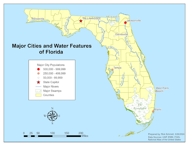
 This week's lab module for Computer Cartography 5007L focused on labeling a map by following established typographic principles. We learned where and how to place our labels for different feature types such as major cities, rivers, and swamps. These types of features represent the feature types you find on a map which are points, lines, and areas. We learned the details of how to properly label these features by creating annotation feature classes. this allows you to edit each annotation feature so that you have full control over the position, size, and style of your labels which leads to the optimization of the presentation of your map. Our lab assignment involved creating a map of the state of Florida using ArcGIS Pro that displays the major cities, rivers, and natural features. Below is my finalized map.


In addition to creating our map, we were challenged with making at least three customizations. The first customization I chose for my map was changing the point symbol for the city of Tallahassee to a red star to designate it as the Capitol of Florida. I also choose to display the text in caps to differentiate it from the rest of the cities. For the remainder of the major cities, I decided to represent them according to population range with unique values and point symbols of varying sizes. In addition, I used different colors to represent the ordinal values associated with the population ranges. Another customization I made was to change the swamp/marsh feature to a swamp symbol and change it to a green color. It seemed to be a nice contrast to the Yucca Yellow that I chose for the county layer. I chose to label the swamp/marsh features in a similar green color as the features with Bodoni MT with italics that I also used for my rivers. Although my label was outside of the feature for the Okefenokee Swamp it remained legible against the Yucca Yellow of my county layer and the blue background, especially with a minimal halo. Overall, I am very excited about what I learned in this lab module. Knowing how to convert labels to annotation features will greatly increase the quality of the maps I create moving forward.


Tuesday, March 19, 2024

Computer Cartography - Module 1 - Map Critique


In this week's module, the topic was the principles of map design. We learned about the history of map-making and how designs have evolved over time. Next, we were introduced to cartographer Edward Tufte who outlined 20 design principles that have been reduced to 6 commandments that we used as a guide to reinforce our understanding of what makes a map good or bad. In this lab, we were tasked with choosing an example of a well designed map and an example of a poorly designed map. Using our new knowledge of map design principles from our class lecture we then critiqued our two maps.

This well-designed map displays the state of South Carolina's wildlife area game zones. Although it may not convey complex information, it is a good example of how to balance and organize various map elements. This map is easy to read, aesthetically pleasing, and leaves no mystery to the reader of what the map maker is trying to convey. The first component that appeals to my aesthetic is that the map maker did a great job with the layout balancing the map elements within the white/negative space around the state polygon. The second component that appeals to me is the creator’s use of the increased weight of the boundary lines that help bring attention to the boundaries for each game zone. Personally, I think they might be a little too heavy but I like the idea. The third component that appeals to my aesthetic is that it is void of unnecessary “map junk” and as mentioned in our lecture, it is simple but effectively communicates its objective. The only negative I see about this map is that some of the county labels run into the boundary lines making the last letter in a few cases illegible. The other potential negative is that Zone 1 occupies the northern portions of Oconee, Pickens, and Greenville counties while the southern portions belong to Zone 2.  The map reader could be confused because the southern portions of these counties appear as though they could be additional counties that are unlabeled. Overall, this map displays sound design principles as described in Edward Tufte’s 6 Commandments.


This map stood out to me as a poor design example because it appears there was little to no pre-conceptual planning before the creation of this map. It lacks any substantial information that might convey its intended purpose or meaning. The labels and symbols are often overlapping making the map so chaotic that it is impossible to draw any meaningful information from it. The first area of improvement would be to determine the map's intended meaning and express this by adding a title. After this is established then all irrelevant data can be removed leaving only what is relevant to the map's intended purpose. With these things complete, a proper layout could be determined to allow for the desired placement of the map elements. The third area of improvement would be to reevaluate the size and design of the north arrow and scale bar. Even if these elements were properly placed, they would almost certainly be too large. At the least, the scale bar would need to display a unit of distance. Overall, this map is a good example of how important planning and forethought are for map-making as well as the evaluation of your final product.

Sunday, March 10, 2024

About Me - Orientation Story Map


Hello everyone!

My name is Rick Schmidt and I was born and raised in northwestern Pennsylvania in a small town called Franklin. In 2011, my wife and I relocated to Port Orange, Florida. We have a 6-year-old son that keeps us busy. He is currently interested in learning the principles of engineering and anything outdoors also recently taking an interest in fishing. I joined the UWF graduate certificate program after comparing a handful of programs concluding that UWF was the most robust, offering more than others that I looked into. Upon completion of the program, I hope to gain employment in the GIS field. Ideally, I would love to obtain a position in the field of archaeology or historic preservation however, I am open to any role because all experience is valuable. This is my second semester in my journey to obtain my GIS graduate certificate here at UWF. So far, I have thoroughly enjoyed the courses I have taken at UWF (Intro to GIS and Photo Interpretation & Remote Sensing). I have learned a ton and cannot wait to build upon the foundation that I have established. I earned a bachelor’s degree in anthropology in 2006 from Clarion University of Pennsylvania where I was introduced to GIS through taking an intro class. I was able to apply the skills I learned in that class using ArcMap while employed with the US Forest Service in the Allegheny National Forest where I worked as an archaeologist for three years.

Outside of working and school, I enjoy playing basketball (played in high school and college) and coaching my son’s sports teams. I enjoy photography as a hobby and volunteer at a local archaeological site. I also serve on the Volusia County Historic Preservation Board.

I look forward to working with everyone this semester!

Here is a link to my Story MapRick's Story Map 

Applications in GIS - Module 6 - Suitability & Least Cost Analysis

In Module 6, we learned about Suitability and Least Cost Path Analysis. We were introduced to performing suitability analysis using both vec...